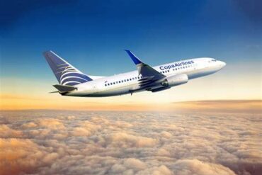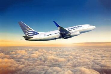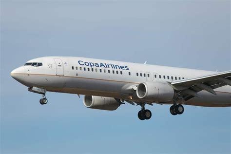
Copa Airlines and United Airlines have one of the closest commercial relationships in the Americas, yet their aircraft look surprisingly different today. That is especially interesting because Copa Airlines’ current livery can be traced directly to Continental Airlines, the US carrier that eventually merged with United in 2010. When United introduced its new blue-focused “Evo-Blue” livery in 2019, Copa could easily have followed the same visual path. Instead, it kept the design it had been using for decades.
The reason has much more to do with corporate independence, brand identity, and the history of the Continental-Copa relationship than with a lack of cooperation between Copa and United. Copa did not simply forget to update its aircraft. The airline has had very different reasons for keeping its familiar appearance, while United had compelling reasons to change its own.
Copa Airlines’ Livery Was Born From Its Continental Airlines Partnership
The story begins in 1998, when Continental Airlines made a major investment in Copa Airlines. Continental acquired a 49% stake in the Panamanian airline, while the two carriers developed a close commercial relationship that included extensive codesharing and participation in Continental’s OnePass frequent-flyer program.
For Copa, the relationship represented much more than an ordinary partnership. Continental was a major US airline with an established international network, while Copa was developing Panama City into an increasingly important connecting point between North and South America. Aligning the two brands made commercial sense because passengers could immediately see that the airlines were connected.
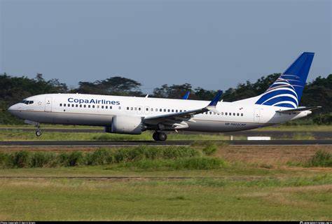
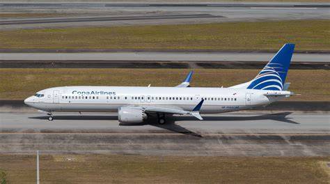
Copa subsequently introduced its current livery in 1999. The design deliberately resembled Continental’s aircraft. Both used a predominantly white fuselage, a blue-and-gold visual scheme, and a large globe-inspired symbol on the tail. Copa’s globe was different, and the airline used its own typography and name, but the overall appearance made the relationship unmistakable.
That similarity was intentional rather than accidental. Continental had invested heavily in Copa, and the Panamanian carrier wanted its aircraft to communicate the strength of that relationship every time they appeared at an airport. In an era before airline partnerships became as visually standardized as they are today, a common design language was an effective way to signal corporate connections.
Continental Eventually Left Copa, But the Livery Stayed
Continental’s ownership of Copa did not last nearly as long as the livery itself. The US airline reduced its stake to 27.3% in 2005 and then to approximately 10% in 2006. By 2008, Continental had completely divested its remaining shares.
The commercial relationship, however, did not disappear when the ownership relationship ended. Copa had already developed substantial value as an independent airline, and Continental continued to work with it. Both airlines also became members of SkyTeam before eventually leaving the alliance in 2009.
This distinction is important when considering Copa’s decision to retain its livery. The aircraft design was originally created to emphasize Continental’s influence, but over time it stopped functioning merely as a Continental-inspired corporate identity. It became Copa’s own identity.
That transformation happened gradually. Passengers who encountered Copa aircraft in the 2000s were increasingly seeing the design as the visual identity of the Panamanian airline itself rather than simply an extension of Continental. Once that happened, changing it became a much more complicated branding decision.
United Airlines Did Not Create Copa’s Current Brand
The 2010 merger between Continental Airlines and United Airlines created an unusual situation. United retained its name, but the combined airline adopted many of Continental’s most recognizable visual elements. The globe logo became the centerpiece of United’s aircraft, while the Continental-inspired livery was retained.
For Copa, however, this did not mean that its own branding had become United branding.
Copa remained an independent company. United did not acquire an ownership stake in Copa when it inherited Continental’s business relationships. The two airlines continued to cooperate commercially, but their corporate structures were fundamentally different from the relationship Copa once had with Continental.
This explains why the 2019 United Airlines livery change did not automatically require a corresponding Copa Airlines redesign.
United’s decision to introduce its new blue-focused design was part of a much broader corporate branding effort. The airline was trying to establish a distinct identity for the post-merger company after years of operating with Continental’s visual language. Copa had no equivalent reason to distance itself from its own livery.
In other words, United was changing because its brand needed to communicate something different. Copa was keeping its livery because its brand did not face the same problem.
Why United Airlines Introduced the Evo-Blue Livery
United’s 2019 redesign cannot be separated from the airline’s turbulent post-merger history.
After the Continental-United merger, the company retained Continental’s globe and aircraft appearance largely because Continental had enjoyed a stronger reputation among US customers. The result was a hybrid: the company was called United, but much of its visual identity came from Continental.
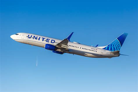
That arrangement worked for a time, but the airline eventually wanted a clearer identity of its own. United introduced a new brand direction that emphasized more blue, a simplified globe, larger titles, and a flowing blue design along the lower fuselage.
The changes also coincided with a broader effort to reposition United as a more premium airline. The introduction and expansion of products such as Polaris business class and Premium Plus formed part of that wider transformation.
The new livery therefore had a purpose beyond making the aircraft look different. It was intended to communicate a different version of United.
The contrast with Copa is significant. Copa had not experienced a comparable need to visually distance itself from Continental. Its customers had already spent years associating the familiar globe-and-stripe appearance with Copa itself.
Copa Airlines Had Little Reason to Abandon a Recognizable Livery
Airline liveries are expensive to change, even when the actual paint job appears relatively simple.
A major rebrand can involve repainting an entire fleet, redesigning airport signage, updating advertising, replacing printed materials, changing digital assets, modifying uniforms, producing new onboard materials, and teaching customers to recognize the new identity. For an airline with more than 100 aircraft, the operational and financial implications can become significant.
Copa has had little obvious reason to take on that expense.
The airline’s distinctive livery is highly recognizable throughout Latin America and at airports across North America. Its blue globe and gold detailing have become closely associated with the Copa Airlines brand, rather than being perceived merely as leftovers from the Continental era.
There is also a strategic argument for continuity. A company does not necessarily improve its brand simply by making it newer. If customers already recognize the design and associate it with a successful airline, a major visual change introduces risk without guaranteeing a meaningful commercial benefit.
Copa’s continued growth has reinforced that logic. The airline has developed one of the most important connecting hubs in the Western Hemisphere without needing to reinvent its appearance.
Panama City Gives Copa a Brand Identity of Its Own
The airline’s strongest asset is not its relationship with United. It is its own network.
Copa operates from Panama City Tocumen International Airport, which it promotes as the Hub of the Americas. The geographic position of Panama allows the airline to connect cities across North America and South America with relatively efficient narrowbody flights.
This network structure has helped Copa develop a business model that is distinctly different from United’s.
The airline operates an all-Boeing 737 fleet, allowing it to maintain a relatively straightforward fleet structure while serving a large number of destinations. Its network is built around connecting passengers through Panama rather than concentrating primarily on long-haul widebody flying.
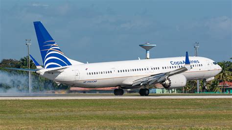
That operational identity is now closely connected to the airline’s visual identity. The Copa aircraft seen at airports from Buenos Aires to New York represent a carrier that has established its own place in the aviation market.
The old Continental connection is part of the history, but it is no longer the entire story.
United and Copa Remain Closely Connected Without Sharing a Livery
The fact that Copa did not adopt United’s 2019 design should not be interpreted as evidence that the two airlines have become distant.
Their relationship remains strategically important. Both are members of Star Alliance, and they maintain codeshare arrangements and reciprocal frequent-flyer benefits. United also provides important traffic into Copa’s network, while Copa allows United to offer connections to destinations that it does not serve directly.
United’s network provides a large pool of passengers from the United States, while Copa’s Panama hub gives those travelers access to destinations across Latin America.
United serves Panama City from major hubs including Houston and Newark, while Copa has developed a much broader regional network from Tocumen. The two airlines therefore complement each other without needing to look identical.
That is a key distinction between an alliance relationship and corporate ownership. Two airlines can cooperate extensively while maintaining completely separate brands.
Copa Does Not Need to Look Like United to Benefit From United
There is a practical reason Copa would not want to simply copy United’s branding: Copa has something valuable that United does not have—the Copa brand itself.
A passenger traveling from the United States through Panama needs to recognize Copa aircraft, airport signage, and boarding gates. A distinctive identity makes the transfer process easier and reinforces the idea that Copa is a separate carrier with its own network.
If Copa suddenly adopted United’s Sky Blue visual identity, it could actually weaken that distinction.
The airline’s customers do not need to see a United-style aircraft to understand the relationship. The Star Alliance branding, codeshares, loyalty benefits, schedules, and connecting experience already communicate the commercial connection.
A shared livery could therefore provide relatively little additional benefit while potentially reducing Copa’s individual brand recognition.
The 27-Year-Old Copa Livery Has Become Part of the Airline’s Identity
The most interesting part of this story is that a livery originally created to emphasize Continental Airlines’ influence over Copa Airlines has survived long enough to become an independent symbol of Copa.
When the design debuted in 1999, the resemblance to Continental was intentional. Today, the same visual elements tell a different story.
The globe on the tail no longer simply suggests Continental’s presence. For many passengers, it is immediately recognizable as Copa’s globe. The blue fuselage, gold detailing, and familiar typography have become visual shorthand for an airline whose network is centered on Panama.
That is why copying United’s Evo-Blue livery would make little strategic sense simply because United and Copa cooperate closely.
United’s 2019 redesign solved a United problem. It helped the airline establish a new visual identity after years of operating under a Continental-derived brand. Copa did not face the same challenge.
Copa’s Next Livery May Finally Break With Continental
There is an interesting possibility for Copa’s future. If the airline eventually decides to introduce a completely new livery, it may choose to move away from both the Continental-inspired design and United’s modern Sky Blue appearance.
After more than two decades, Copa has accumulated enough independent history to create a visual identity based entirely on its own story. Its Panama City hub, Latin American network, operational efficiency, and growing international presence provide plenty of material for a modern brand.
Such a redesign could preserve recognizable elements of the existing identity while updating the proportions, typography, colors, or tail symbol. Alternatively, Copa could choose a much more radical direction.
What matters is that there is no longer a corporate requirement for Copa to follow United.
The relationship between the two airlines is strong precisely because it does not require them to become the same company. United Airlines has its Sky Blue livery, while Copa Airlines has a design that has evolved into one of the most recognizable airline liveries in Latin America.
The irony is that Copa’s aircraft still visually carry a piece of Continental Airlines history, even though Continental’s ownership ended years before the United merger. United changed that heritage in 2019 because it wanted to establish a new chapter for its own brand. Copa kept it because the same heritage had already become part of its own identity.
That is ultimately why Copa Airlines did not copy United Airlines’ Evo-Blue livery. The two carriers may share an alliance, codeshares, frequent-flyer benefits, and a remarkably valuable commercial relationship, but they do not share the same brand strategy. For Copa, the old livery stopped being Continental’s design a long time ago. It became Copa’s.